Web style guidelines
In order to ensure consistency across all of Memorial's websites, we ask users to familiarize themselves with the following 10 web style guidelines.
Memorial has hundreds of website users updating more than 250 different Memorial websites. The purpose of these web style guidelines is provide our users with instructions they can follow when making certain arbitrary choices, such as whether or not they should capitalize all the words in a page title. While it would be grammatically correct to title a page About us or About Us, it would be disorderly if some sites capitalize all of their page titles, while other sites do not.
Top 10 web style guidelines
every Memorial user should know
#1
For titles and headers: use sentence case
Page titles, main menu items, left-hand links and headers should be in “sentence case.” In sentence case you only capitalize the first letter of the first word in your title, as well as any proper nouns that would normally be capitalized in a sentence, such as Canada or June. Every time you create a new page, or a header on that page, please use sentence case.
Example:
Graduate programs
Not: Graduate Programs
#2
Page titles should be short and descriptive
(not long or vague)
By simply reading your page title, a user should know what kind of information they will find on your page. Welcome is a poor and vague page title, whereas Graduate programs is descriptive and useful.
Example:
Graduate programs
Not: Welcome
#3
Naming content types
When adding any content type to a page, you will be asked to name it.

Every time you create new content on a page, you should fill out the name field of your content type by using the following formula: [content type here] - [content title here]. Doing so will ensure that all users on your site can quickly and easily identify what a piece of content is, based on what you've named it.
Example:
News article - New climate change regulations may mitigate past damages
Not: Climate change
#4
Name your images properly
When you upload an image to T4, it will ask you to name it. It is important that you provide a proper name for several reasons, but primarily because it will help you and your site users easily locate the image in your media library. Also, whatever you name your image will be the file name if someone downloads it. It is also important to fill in your Alt text field for accessibility and SEO.
Example:
Jane Johnson in her biology lab
Not: IMG_4405
#5
Name your files properly
When you upload a file such as a PDF to T4, it will ask you to name it. It is important that you provide a unique name for all your files, so they are easily located and distinguished from each other in your media library. Also, if someone downloads your file, it should have a distinct, identifying name. Lastly, your file title will become part of your URL when it's opened in an internet browser, so it should be kept short and clear as possible.
Example:
Terminalfour user guide
Not: Document_1
#6
Use a maximum of three text treatments per page
You should never use more than three text treatments on a single page, and always use paragraph font for your main body text. As a rule, you should use one of H1, H2 or H3 header types for your main headers, one of H4, H5 or H6 for your subheaders, and paragraph for your paragraphs.
#7
How to write a date/time
When writing a date, it should always be: day, month, date, year, as in Saturday, July 11, 2021. Never 11 July, for example. You can abbreviate any month with more than 5 letters, using a period to abbreviate the month (Sept.).
Example:
Feb. 11, 2021
Not: 11 February, 2021
When writing a time, hours are written numerically (10:30, not ten-thirty). If the time starts on the hour, do not use zeros (write 12, not 12:00). Use periods with a.m. and p.m. with a space following the number.
Example:
11 a.m.
Not: 11:00AM
#8
Do not underline text on your page
Internet users associate underlined text with hyperlinks. They will expect any underlined text to be a link to another page. To emphasize a line of text, use bold or italics, not underline.
Example:
Registration begins May 11.
Not: Registration begins May 11.
#9
Avoid "click here" and "read more" hyperlinks
When using hyperlinks, do not hyperlink the words "click here" or "read more." Instead, write and hyperlink a sentence that will let users know where the link will take them. This makes your page accessible for people using screen readers.
Example:
To request training, book a date now.
Not: Click here to book a training session.
#10
Hyperlinks should open in the same tab for internal links, and a new tab for external links
When linking to an external site:
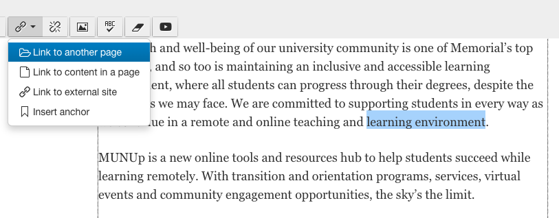
If you are creating a hyperlink to an external site that is not a Memorial website, choose "Link to an external site," and set your target to "new window."

When linking to a page on your own website:
If you are hyperlinking to a page on your own site, choose "Link to another page," and select the page from the list of options. This will ensure the link doesn't open in a new tab. Additionally, internal links will not break if you ever change your site structure.

When linking to another page on MUN.ca outside of your own site
When linking to another Memorial website to which you don't have user access, choose "Link to an external site," and set your target to "none" so the link does not open in a new tab.
