Cards
A card is a good way to call your site visitors' attention to an action such as registering for an event or downloading a file.
The card content type lets you determine what the text on your card will say, which icon your card will display, what the text on your card's button will say, and the URL to which a user is taken when they click the card's button. This content type is currently only available on select pages on mun.ca. If you would like to use cards on your site, please contact MarComm.
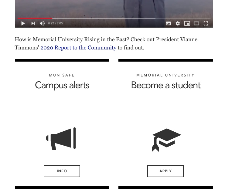
Here is an example of two cards:
To create a card
Open your page in direct edit view (Moderators should use standard interface)
You will be taken to the direct editor for you page.
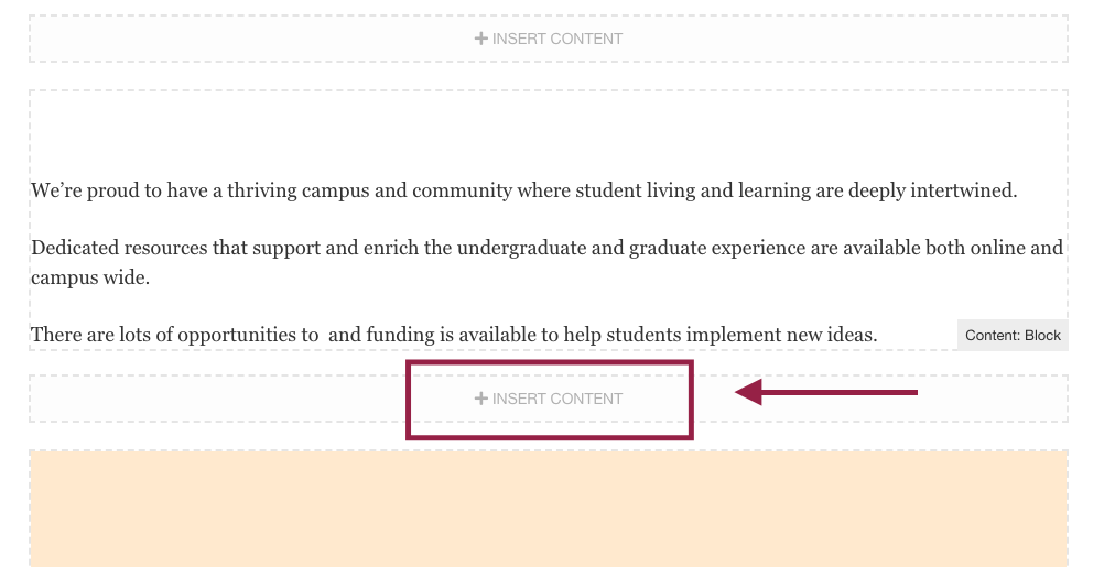
Click on an empty "+insert content" block where you would like to place your card:
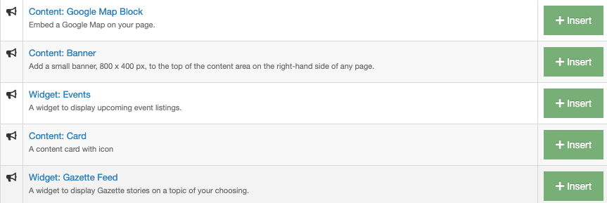
Locate the content type called "Content: Card" and click the green "Insert" button:
To create your card,
you will need to fill out the following fields:
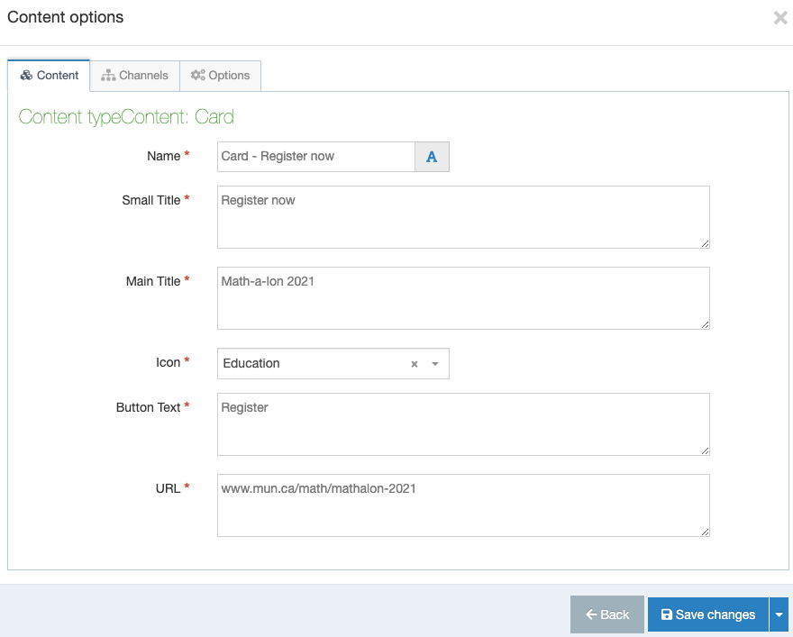
Name:
You should name your Card: Card - [something descriptive here so site users will know what the card is for.]
Small title:
The is the text that appears at the very top of your card
Main title:
The is the larger text that appears near the middle of your card.
Icon:
Use the dropdown menu to select an icon to appear on your card.
Button text:
Type the text you would like to appear on your card, ex "Apply now."
URL:
Enter the URL to the page you want users to be taken to when they click your card.
Don't forget to save, approve, and publish your changes so they appear on your website.